Acer - PLANET9
Sign-in / Sign-up
My Role
Timeline
Team
How can we reduce friction for users who don't remember how they signed up when trying to sign in?
PLANET9 is Acer’s eSport platform built for next-gen semi-pro gamers.
In our platform, in addition to Email, we offer third-party sign in and sign up options such as Facebook, Google, Apple, Discord, and Twitch to make the process easier for users.
Users often forget which method they used to register for an account, resulting in sign in issues or multiple accounts creations that cannot be consolidated.
Define and implement a streamlined sign in/sign up flow that reduces drop-offs, minimizes edge-case errors, and supports scalability across platforms.
Understanding data structure
Firstly, I spoke to our engineering lead to confirm the structure of the data we store in the database and to ensure that our knowledge is aligned and we are headed in the right direction.

Understanding data structure
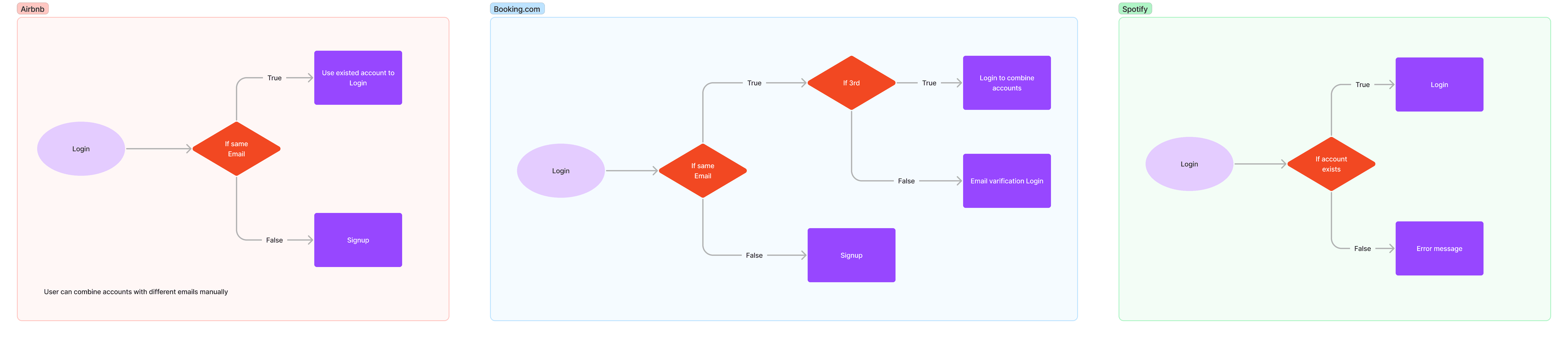
I reviewed how products like Airbnb, Booking.com, and Spotify handle sign-in key validation and onboarding flows. While the core function was similar, the design patterns varied significantly—highlighting how even small differences in validation logic and feedback timing can meaningfully impact the user experience.

Design Decision
Based on my research and internal discussions, I identified Airbnb’s approach as the most user-friendly and context-aware. I adopted its logic as the foundation and designed a new flow that helps users confirm their original registration method—guiding them back to the correct sign-in path if they make a wrong selection. This reduces friction and prevents unnecessary errors during login.
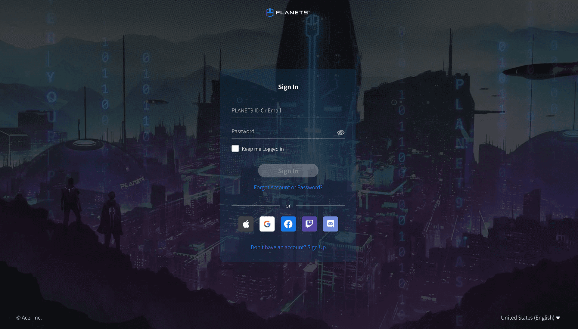
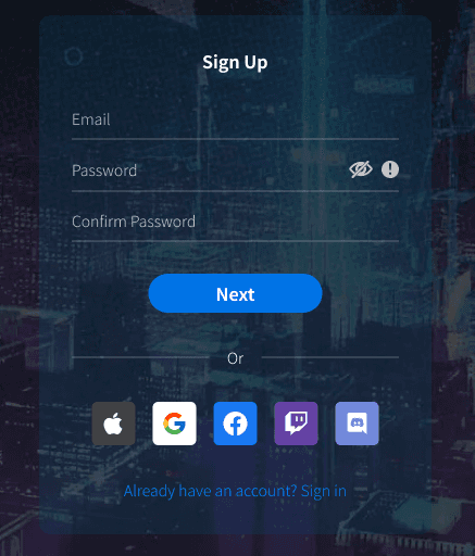
While modifying the programming logic, I also redesigned the UI to improve clarity, reduce friction, and give the interface a more modern, lightweight feel.
I applied two key design principles in this process:
1. Error Prevention
Rather than relying on error messages alone, I focused on eliminating scenarios where users were likely to make mistakes. This included refining input logic and adding subtle confirmations to guide them through critical steps.
2. Form Design & Perception
I paid close attention to the visual structure and spacing of the form, aiming to make it feel lighter and less intimidating. A visually streamlined form encourages completion and reduces frustration during sign-up.

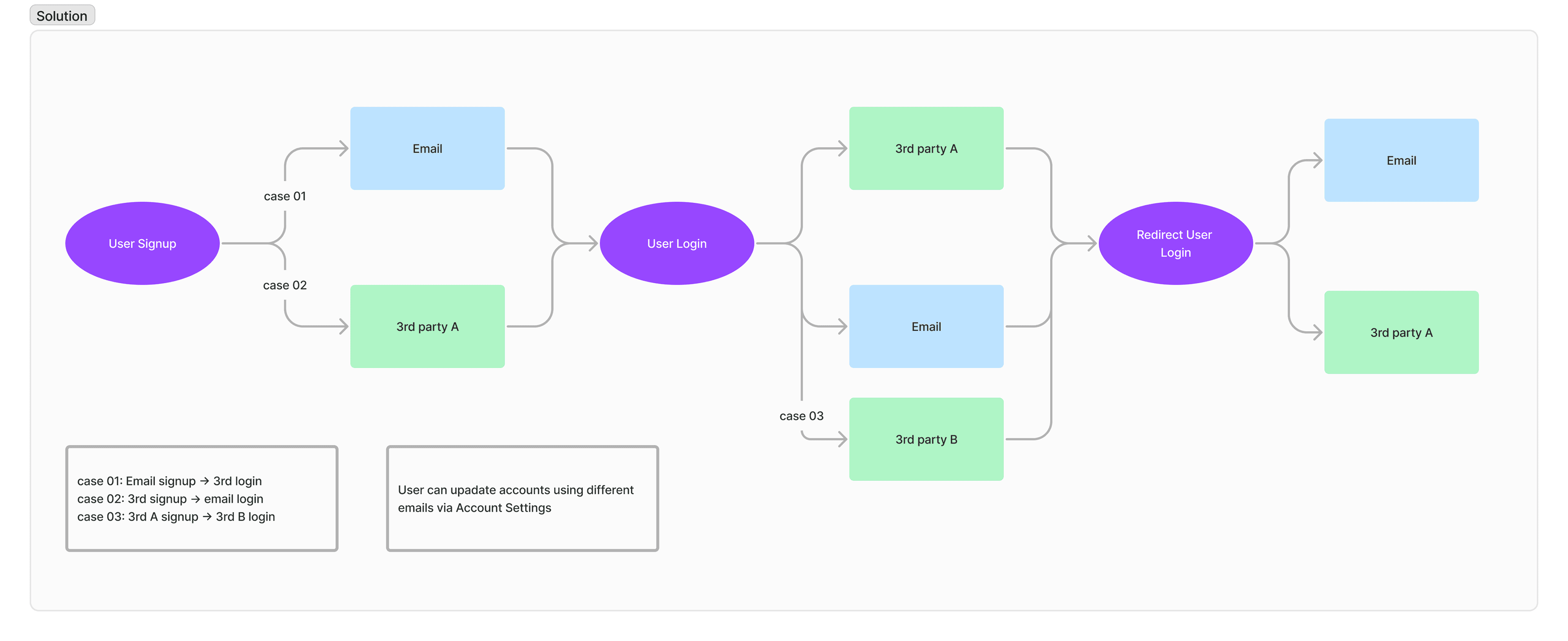
To prevent users from being blocked by incorrect sign-in attempts, I designed logic that automatically detects mismatches between sign-up and sign-in methods.
Here are two key scenarios:
Case 01
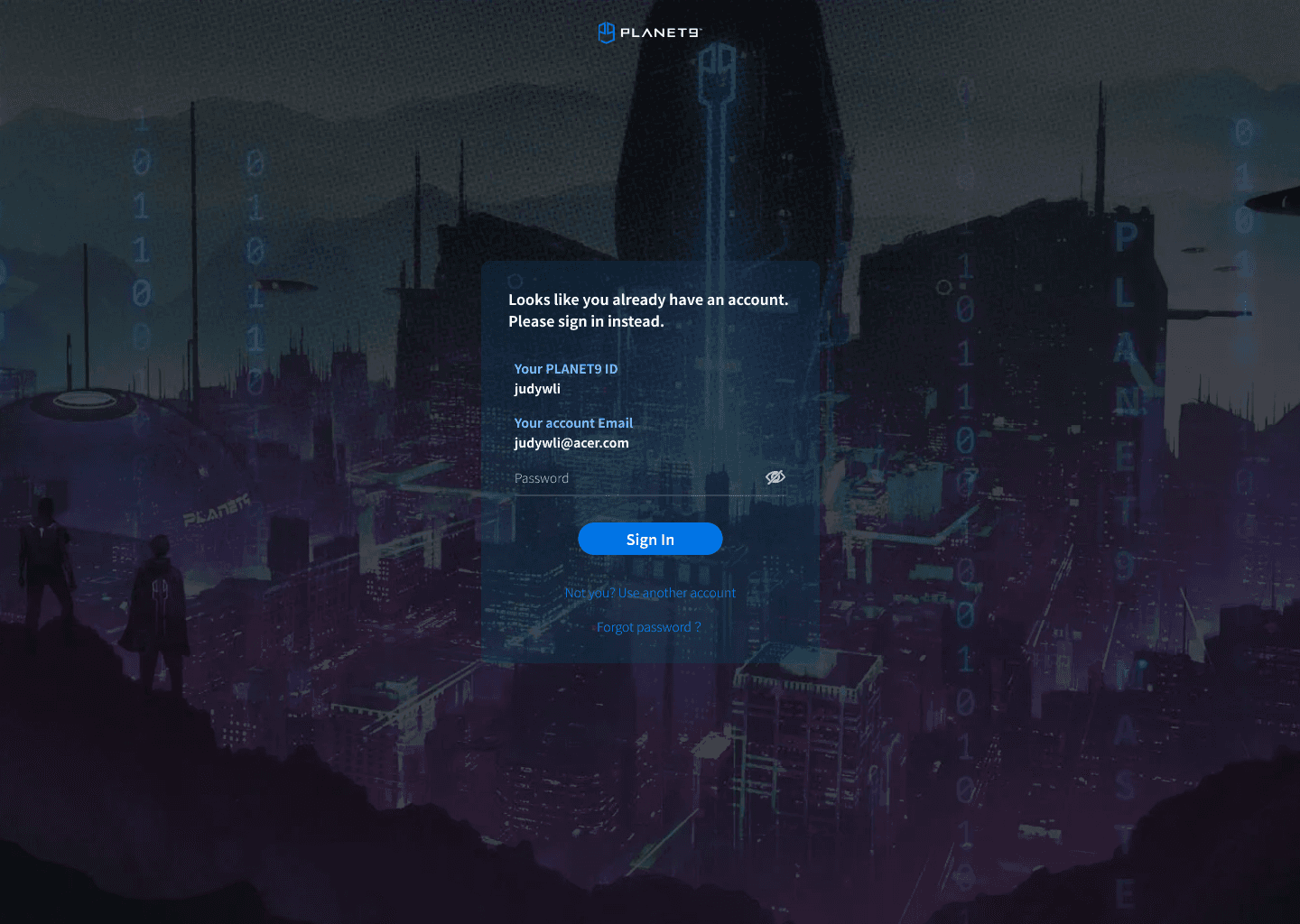
If a user initially signed up using email but mistakenly clicks a third-party login (e.g. Google), the system recognizes the mismatch and redirects them back to the email sign-in flow—preventing a login error and reducing friction.
Case 02
If a user signed up via a third-party service but tries to sign in with email, the UI will detect the original method and guide them to the correct third-party option—ensuring continuity and avoiding unnecessary confusion.

0
Related customer complaints
- Decreased the customer complaints to 0.
- Prevented the creation of duplicate account.
- Enhanced the account sign in/sign up and setting process for a better user experience.
- Improved UI & accessbility.
- Made date of birth required input field for e-commerce marketing purpose.
- Improved the process for resetting a forgotten password, directing users who signed up with a third-party service to use that service to log in.